A little blurb about Nintendo Power’s Mega Man 3 coverage.
Nintendo Power #20 with Mega Man and Rush on the cover came out in January of 1991, featuring a full 20 page spread about Mega Man 3 that included maps, tips, and some amazing artwork. They also had a pull-out poster for Mega Man 3 in issue #18, featuring beautiful art of the bosses and Gamma, in the same style. Some of the art also appeared in the Nintendo Players Guide NES Game Atlas.
Somehow (I’m betting on some kind of Google search myself) the poster and a handful of character art became featured in the Mega Man Official Complete Works book on page 149, and some clips from the poster were even featured on the cover itself.
Did Capcom have to ask for any specific permissions to use this art? Who was the artist?
Much as I’d like to answer, I don’t know. There’s a list of illustrators in the front of every magazine, but not who did what. Also, there are both American staff and Japanese staff, because Nintendo Power had a sister magazine in Japan called Family Computer Magazine (FamiMaga) that used much of the same coverage and art. Was the artist American or Japanese? I might not know the answer, but there is something I can tell you. The artist, whoever it was, had official Capcom materials to base their work on.
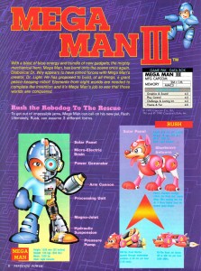
Page 8 kicked off their coverage with a story synopsis and a schematic rundown of our two heroes, Mega Man and Rush. Though the art is original and not Capcom’s own, the labeling over Mega Man and Rush’s various parts and function is way too accurate not to have been taken from Capcom’s own materials.

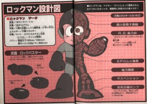
Comparing this Japanese Rockman schematic from the Rockman X Daizukan book (an image that was also used in Rockman World/Mega Man Dr. Wily’s Revenge in the get weapon screen) with Nintendo Power’s above, the height, weight, shell, motor, and the parts descriptions are nearly identical (with a few minor changes, like “Rockbuster” to “Arm Cannon”).
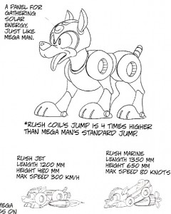
And Rush? Try comparing the information there to page 120 of Mega Man Official Complete Works below.
The location of the solar panel, the height the coil can extend the jump, the top speeds of the vehicles and rough dimensions of them all match pretty well with what NP had. The only really obvious errors are with the metric conversions. 300kph is only 186 miles per hour, not 556. And the 80kph top speed of the Rush Marine should actually be 80 knots, making it 92 miles per hour (but still pretty fast for a submarine). Otherwise, I’d wager that the height and weight for standard Rush, as well as his motor power and the shortwave antenna are also accurate, but are based on some source that I’ve yet to come across.
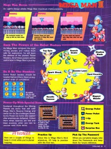
In addition, many of the poses used by Mega Man using special weapons, the bosses, and minor enemies are the same as you’ll find in the official artwork in the Mega Man Official Complete Works book. Those of you with the book, try comparing the below page from Nintendo Power with pages 17 and 18 of MMOCW for yourself! What do you think? Pretty spot on, wouldn’t you say?
Many of the pictures NP’s art was based on were not widely published in the US in 1991 (if at all) so the only conclusion left is that the artist was working directly from Capcom’s own materials, I presume to make them into something the artist deemed more appealing for the American market. And I must admit, I found the art extremely appealing when I first saw it nearly 10 years ago! I guess it worked.
Tomorrow is the final day of retromags week. Have I saved the best for last? Probably not, but meet me here tomorrow anyway! Home stretch, guys! Let’s go!


I received my own copy of the Mega Man Official Complete Works (and it's X counterpart) two days ago only, so it was pretty easy to do a side-by-side comparison! I'll have to agree with you: whoever did the Nintendo Power art must have had access to those pictures, as they are way too similar. It's a different style than what we're used to, but it's not ugly.
Heh, when I was a kid, I HATED the art. I liked the art they had for Mega Man 2 better, and of course the official art in the MM3 manual…
On the other hand, MM4’s would be the worst art the magazine ever had. At least Mega Man 5’s was really cool, and similarly inspired, yet different.
The MM5 and MMIII issue with all the boss character submissions was probably my very favorite issue of NP for a very long time! I was in complete denial later on that Punk wasn’t supposed to be green…
NP’s MM4 stuff was rather bad, lookin’ like it was drawn with big thick markers by people who might have only seen the sprites. But the absolute WORST I would say was their MMV (for Super Game Boy) art. I remember hating that most of all, though I haven’t actually looked at it for a while now… I’m not sure I even remember what art there was for the game. A weird looking Eddie and Dr. Light? I’ll have to dig it up.
One thing I loved about the MM2 art was how they drew Mets with the googly eyes, big brown work shoes and red crosses on their helmets. I learned to draw mets was from trying to copy that style back in grade school, so I’ll always have a soft spot for that design. It’s too bad Inafune didn’t include the old Met design in the Official Complete Works. I don’t know if he’s trying to pretend like he never drew mets like that, but the proof will forever be on the Rockman 2 cover art!